
Project Type
Context
Data-Drive Project Redirection: UI Redesign with Usability Focus
A local photographer reached out, looking to redesign his business website with new colors and add new pages and sections to the existing site.
After conducting a heuristic review, it became evident that the website had significant usability issues that needed to be addressed before implementing the client's original vision.
These findings shifted the original focus of the project beyond a simple UI redesign, expanding the scope to tackle these broader usability challenges.
Redirection Process
Original Project Scope:
Applying updated brand color to an exisiting website
Adding new pages and sections to exisitng website
⬇️
3
Results:
Shifted the focus to usability improvements for the business owner.
⬇️
Updated Project Scope:
Examine and iterate the current site structure, user and task flows to improve the user experience
Redesign the user interface to ensure consistency throughout the website.
Problem
Navigation issues found based on heuristic review.
Users have trouble navigating to the information they need due to:
inconsistent labeling
unclear next steps
visual overload
Hypothesis
Addressing the problems found in the heuristic review will improve usability and overall satisfaction.
The hypothesis was proposed to the business owner, and the original project scope was revised accordingly.
By addressing the specific usability issues identified in the heuristic review, we expect to enhance the user experience significantly, leading to improved navigation, clearer communication, and ultimately, greater overall satisfaction for users.
success Metrics
Users' perception of ease when navigating the website
Based on the business's goals, the success of the project will be measured by users' perception of ease when navigating the website. The easier it is for users to find the information they need, the more likely they are to book a service with the business.
User Flows and Labeling:
Where Should Users Go Next?
By mapping a task flow aligned with the business goals, I identified areas where users might struggle with key actions. I also mapped and iterated on the sitemap to assess the structure, improve labeling, and reorganize content for better navigation.
Main Concerns:
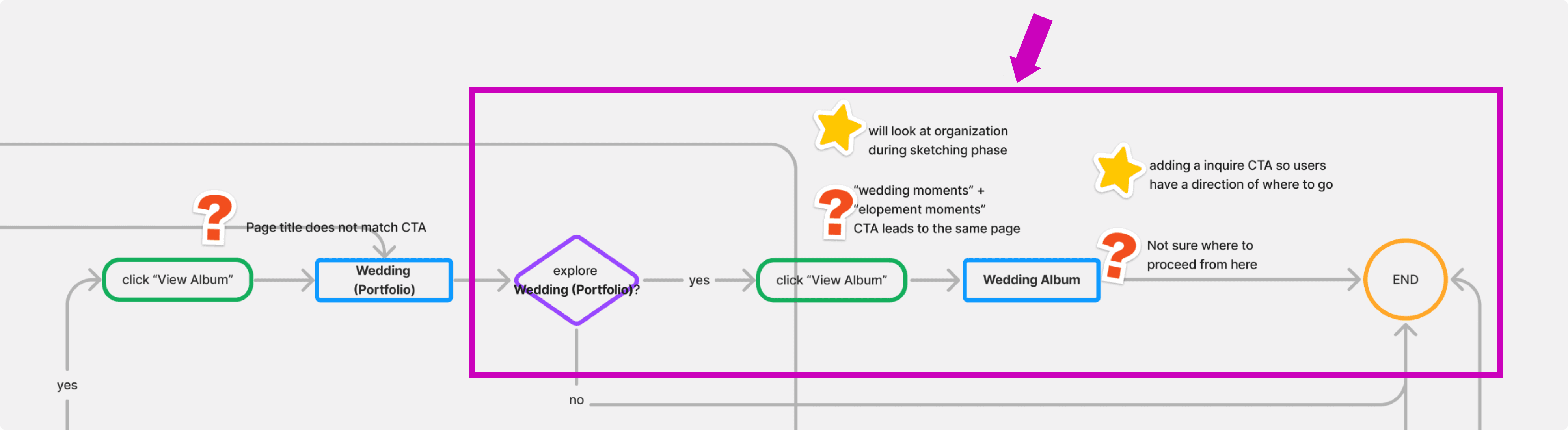
01 Inconsistent Labeling Across Pages
The formatting of titles, labels, and colors varies across different pages, leading to a lack of consistency.
The labeling across pages were inconsistent before the iteration
02 Misleading CTA Labels
Some CTA buttons do not lead users to the pages they intend to reach.
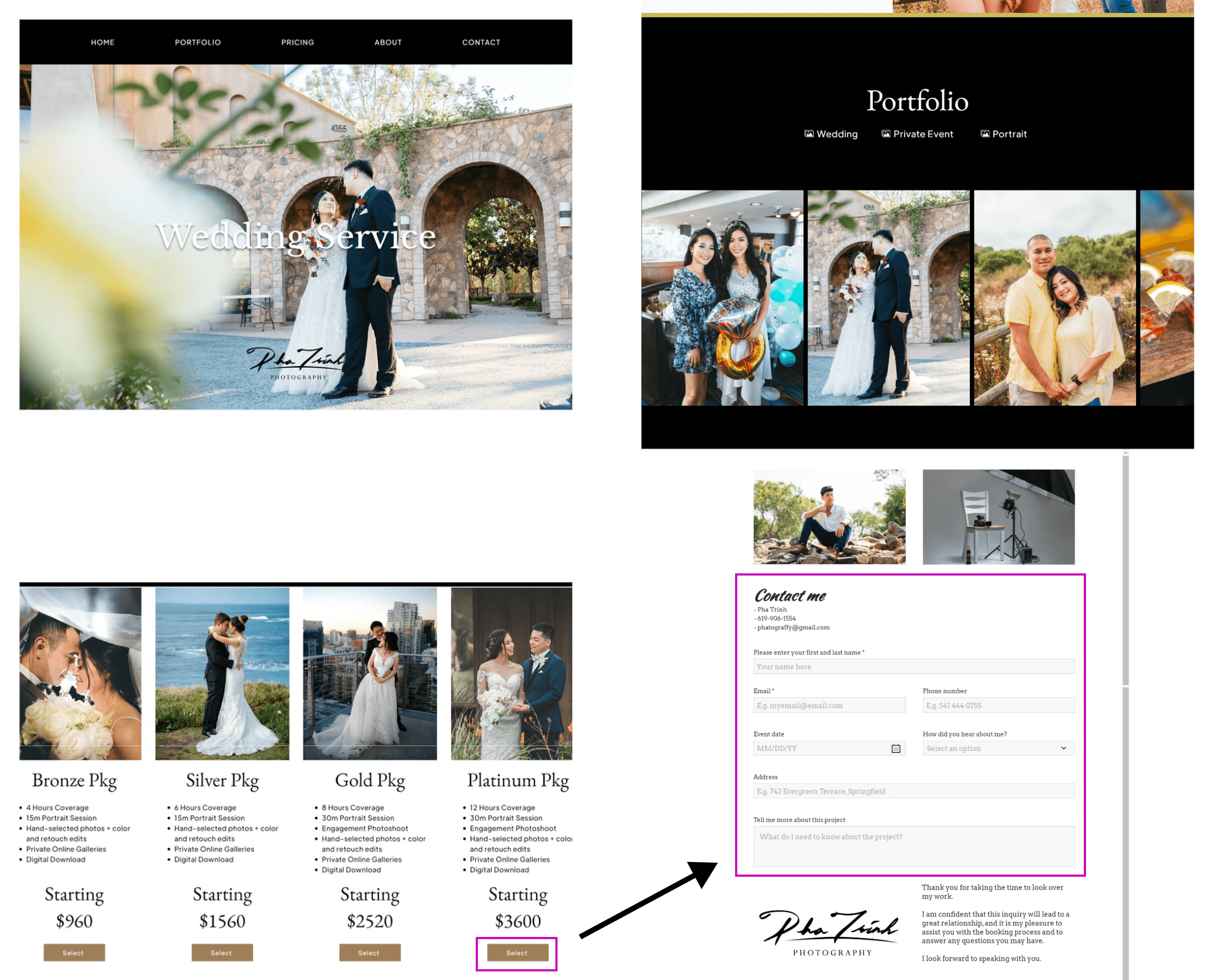

Unexpected next step: Clicking the "Select" button leads users to the contact form.
03 Missing CTAs
Some pages lack a clear CTA, leaving users without guidance on what action to take next.
Mapping out the user flow uncovered gaps where a CTA could make the path clearer and more intuitive, ensuring users don’t get stuck or confused about what to do next.
Iterated Design
Refining for Clear and Focused Engagement
01 Showcasing the photographer’s work
Users expressed in interviews that the first thing they want to check when visiting a photography business is the work, so they can see if the style fits their preferences.
This also solves the the readability issue on the original page
02 Providing clarity with purposeful titles
The title 'Services' clearly indicates to users the type of content they can expect to find in this section.

The original hero page (left) required extra steps to see the photographer's work; in the iterated version (right), users can see the photographer's style at first glance
Control, Personalization, and Efficient Navigation
01 Enhacing user control
Based on users' choices, clicking on individual albums on the Portfolio page takes them to their desired content in the next step of the flow
Users have more control of what they want to see
02 Reducing Cognitive Overload for Users
Instead of displaying images on a static page that requires scrolling, the iterated version features a slideshow with thumbnails below, allowing users to enlarge and view only the images they want
03 Providing clear path of navigatioin
Adding a CTA helps guide users to their next step, ensuring they have a clear path to take action and improving overall navigation flow.
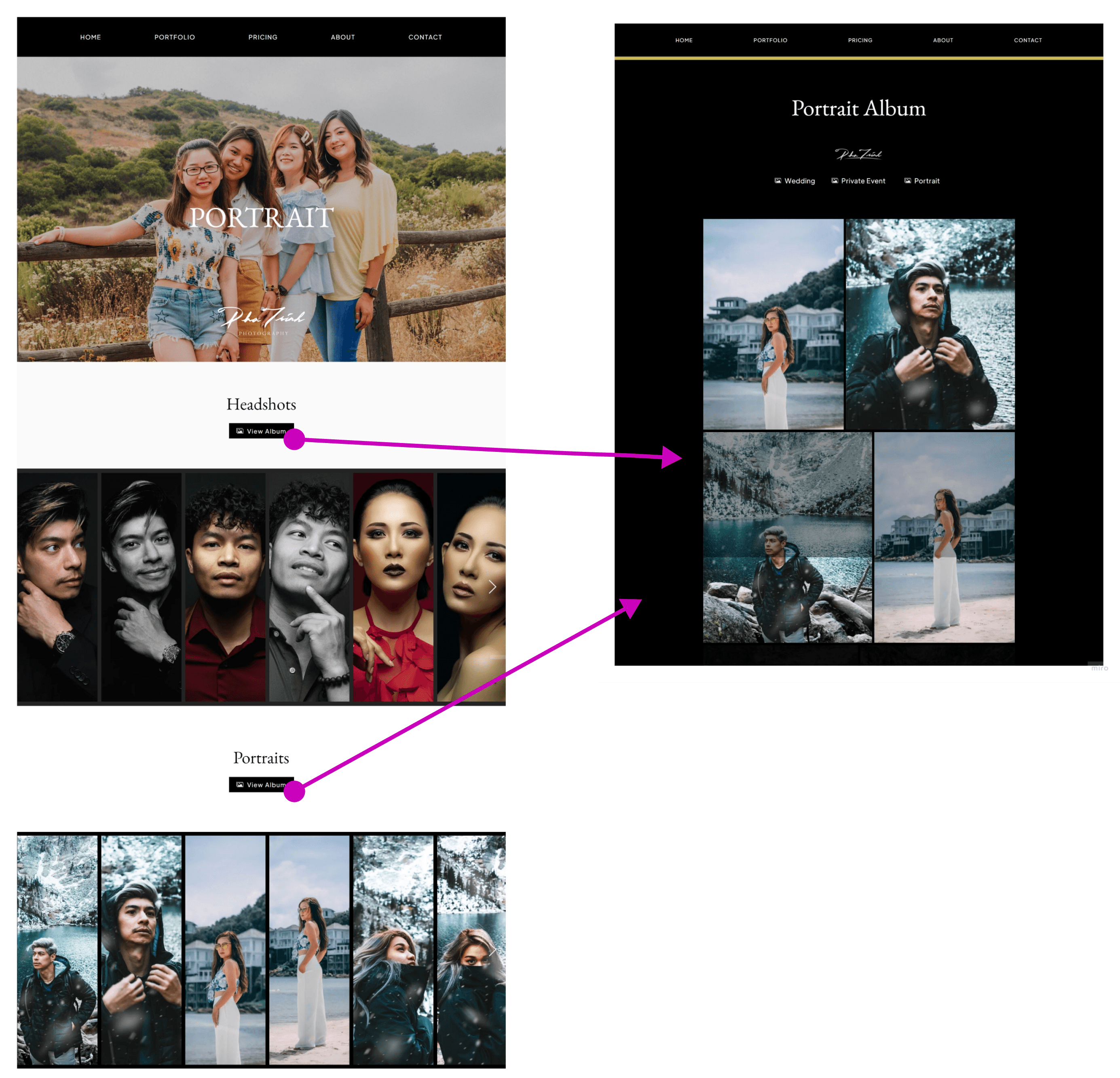

Orginal Album Page & Flow
No clear CTA button to guide through the flow
The "view album" buttons for both the headshots and portraits sections lead to a single "Portrait Album" page, which may confuse users.
Iterated Album Page & Flow
From the portfolio page, users can select an album to view, which then leads them to the corresponding section on the album page.
Streamlining Navigation and Decision-Making with Visual and CTA Clarity
01 Providing simple navigation
Users can see all the services the business offer on one page without having to navigate to different pages.
02 Simplifying the decision-making process with visual clarity
Using different shades of the brand color to highlight the unique services in each package tier, making it easier for users to make decisions.
03 Naming the CTA button intentionally and logically to guide users to the next Step
Changing "Scheduling a Consultation" to lead users to the contact form, rather than the original "Select" button, clarifies the next logical step.
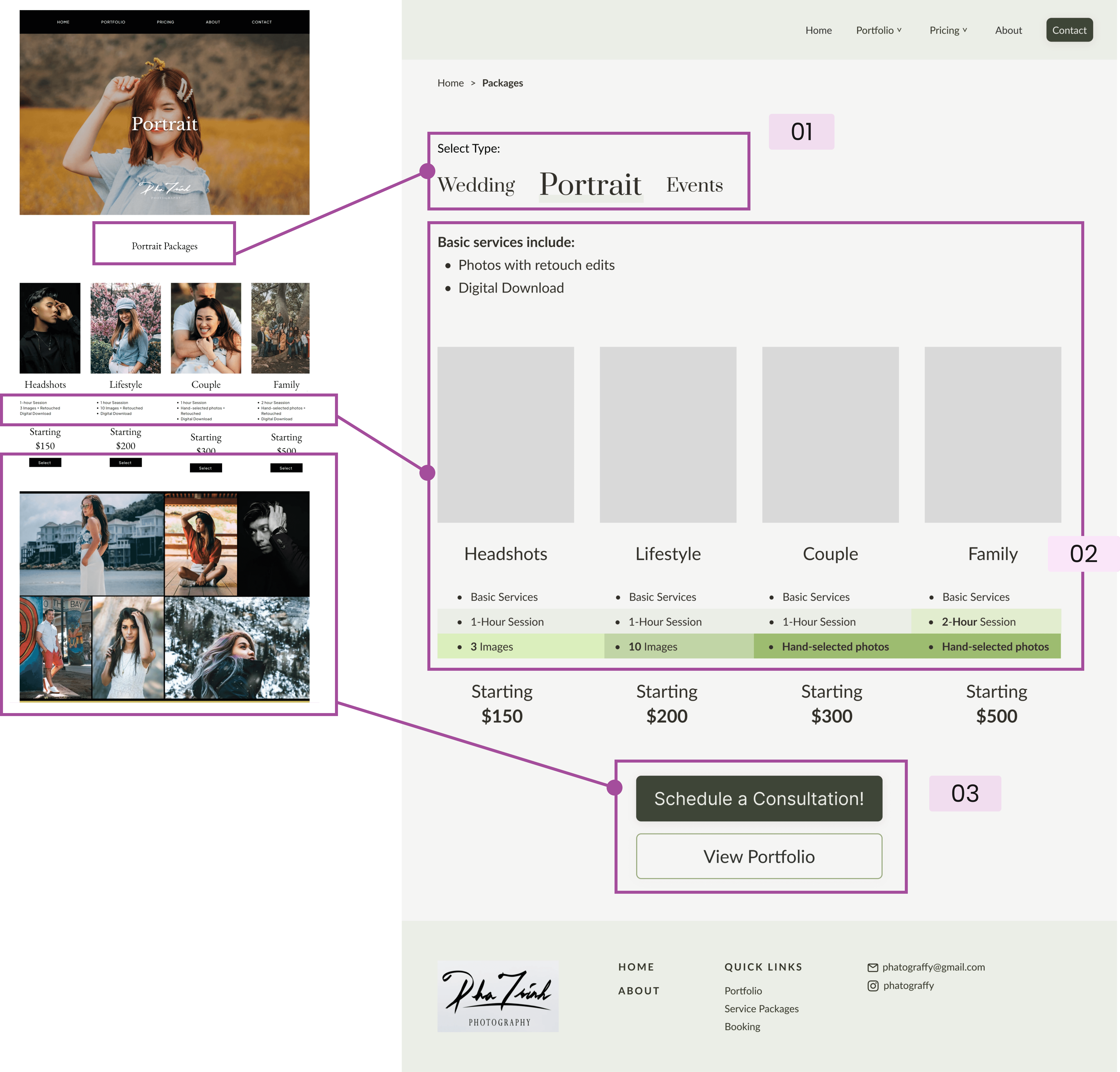
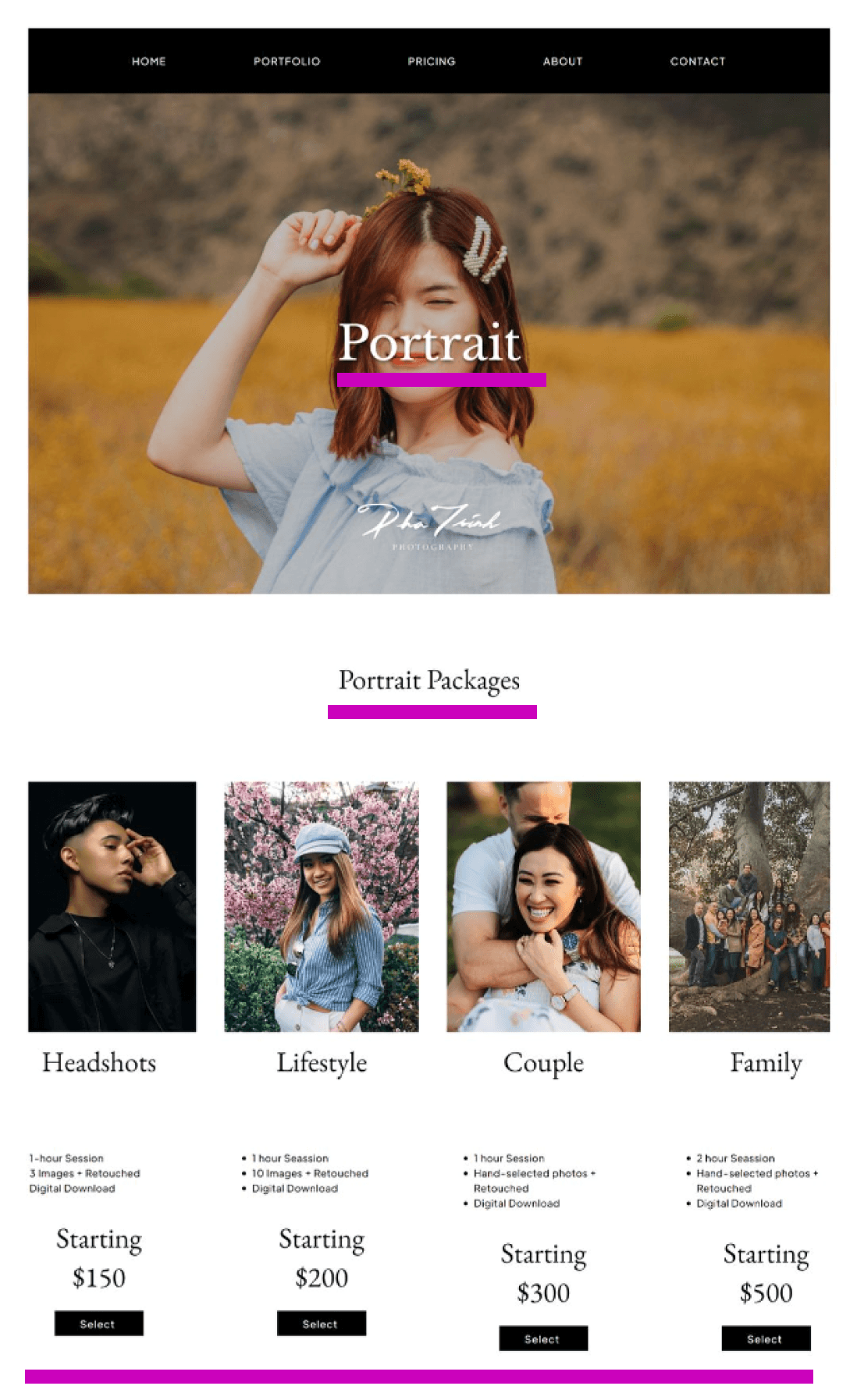
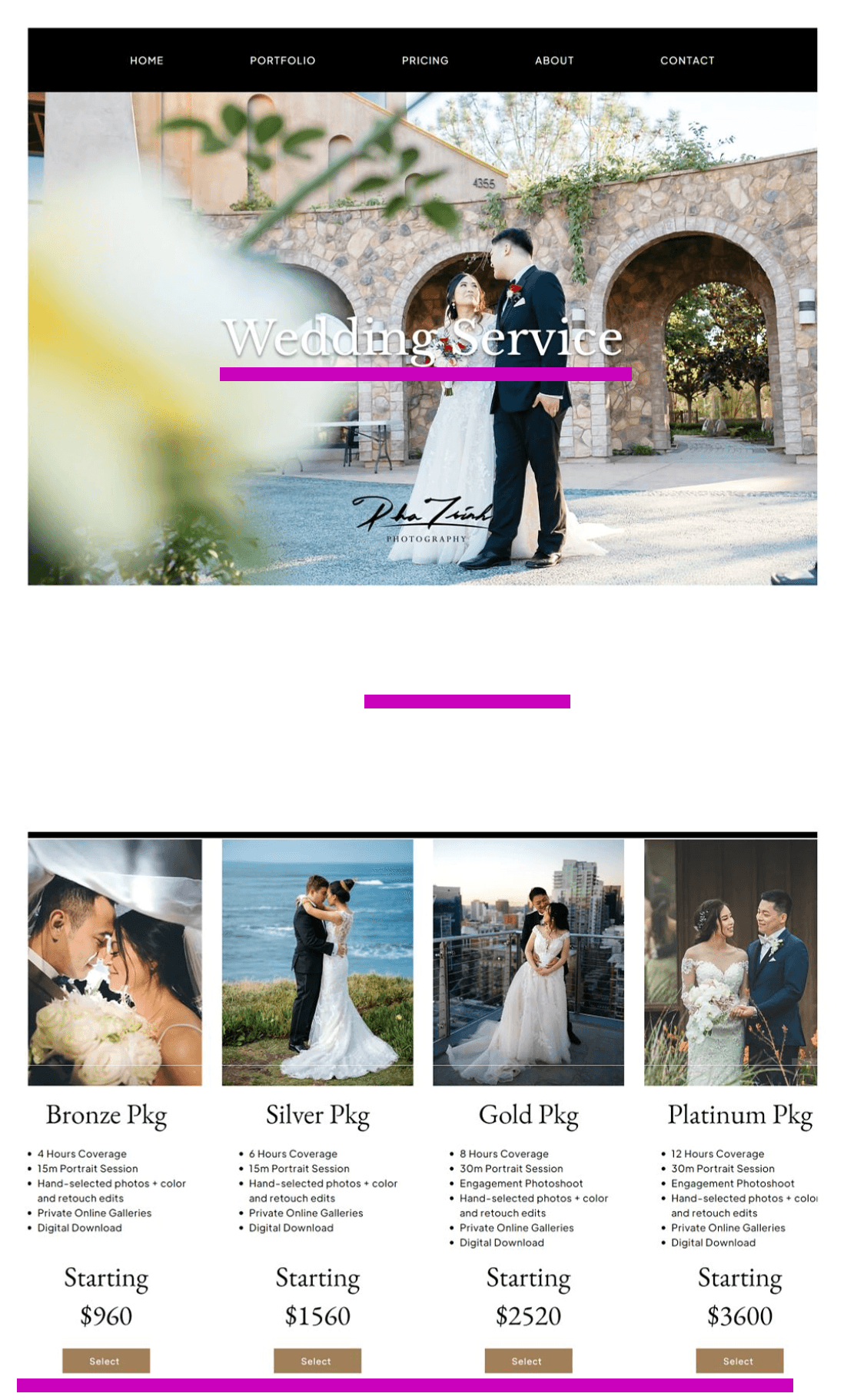
Original Package Page (left)
Difficult to distinguish the differences between package tier details
The "Select" button, which gives the impression that users can choose a package, leads to a contact form, potentially causing confusion.
Images at the bottom may overwhelm users
Successful Redesign!
“I felt like I was in control of what I was exposed to a little bit more.” - Rachel
Based on usability test, the overall user perception of navigation is better with the updated website, based on usability testing.
Simpler, user-controlled navigation and better use of space.
The display of images are more effective, while maintaining white space balance.
The original design’s large images and excessive scrolling made it harder to get an overview of the photographer’s work.
Clear categorization and accessible calls to action ("View Portfolio" and "Send Message")
Future Improvements Based on User Feedback
The current booking flow surprised users (and not in a good way)
The current flow requires users to book a consultation, but most users had expressed their wish to directly book a date and time for their event. Simpler, user-controlled navigation and better use of space.
This is a potential problem space that could be explored further in future projects.
jch3 design
cj.chang06@gmail.com